
Emotions and psychology go hand in hand when it comes to making important decisions about food. So, the interior décor or the table design alone won’t help you influence their thoughts and actions. Rather, you need something stronger, which can instantly reflect one’s emotions right from the moment the person enters through the door. And that’s where colors come into play!
Have you ever noticed how different restaurants with a farm-to-table restaurant theme play with green and earthy colors? Similarly, if you look at the logos of top fast food brands in the USA, you will find the most dominating shade being red and its variants.
Colors have a huge influence on the human subconsciousness. If your dream is to deliver an awesome and unforgettable dining experience to your guests, it’s time to decide which shade you would like to play with. But there’s a catch! You cannot just go with random hues and shades.
That being said, we have crafted a detailed guide below, explaining the best colors for restaurants and their roles in influencing your guests’ actions.
The Psychology of Colors in Restaurant
Truth be told, the human subconscious mind is heavily influenced by external stimuli. Take rain sounds or ocean waves as examples. Listening to these can help calm your frenzied nerves and fall asleep within minutes.
Similarly, watching videos of your favorite food on your phone will make you salivate. Similarly, hues have an immense role in influencing a person’s emotions and appetite.
From the brand’s logo to the restaurant’s interior, choosing the right color will help you influence your guests’ psychology greatly. Take warm colors like red and orange as examples. It is believed that these shades evoke excitement and energy within the onlookers.
Red can easily stimulate one’s appetite by increasing heart rate and sending signals to the brain. On the other hand, orange is used to promote social interaction at diners.
Cool tones, however, will have a completely different influence. For instance, blue and its variants are often associated with tranquility, imparting a sense of peacefulness in the ambience.
Unfortunately, it suppresses the hunger and that’s why restaurants don’t prefer using this as the dominating shade. Green and brown, on the other hand, are great in exemplifying your commitment towards serving fresh ingredients and healthy dishes.
Whether you want to create a sophisticated ambience for your fine-dining setup or keep the queue increasing in size for your fast food restaurant, colors will be your best companion. All you have to do is focus on understanding their association with human psychology.
Key Color Categories For Restaurants
Before you dive into researching the best paint color for a restaurant, let’s understand the categories first. It will help you decide which specific group of hues can be aligned with the interior theme and your target customers.
Warm Tones
The main colors in this group belong to the red, yellow, and orange spectrum. They are associated with energy and excitement for food to be served on the table. That’s why fast-food settings often use different variants of this spectrum to increase their customers’ appetite.
Cool Shades

Cooler tones are said to have a direct association with serenity and peacefulness. Here, the most preferred shades will be of green, blue, and purple spectrums. So, whether it’s a fine dining table set up or a health-focused décor, they will amplify your brand’s purpose.
Neutral Colors
Lastly, we have shades like black, golden, and white. These are used for complimenting other colors and create a balanced look in the restaurant interiors. Most modern and minimalist diner setups leverage these tones to invoke a sense of cleanliness and sharpness.
Best Color Ideas For Restaurant to Create An Awesome Ambience
Warm colors: Energize and stimulate
1. Red
Known to make a strong psychological impact, this shade is perfect for fast-paced diners, like a hotdog station or a burger restaurant. It raises the energy levels, increases appetite by several notches, and creates an urgency in the customers. They will make faster decisions about their orders and can wait a little longer to enjoy your delicious cuisine.

Incorporating it can be a bit difficult because the darker hues tend to overwhelm the onlookers if not properly placed. So, use a red-colored accent wall or include it as a base for your brand’s logo. Do not go overboard as that will create a very powerful persona, not quite accepted in a dining setup.
2. Orange and Yellow
If you want to go on a warmer side, choose restaurant color palette ideas that can blend in these two shades seamlessly. Both impart a welcoming feeling, ensuring your guests find comfort in the interior décor. For example, an orange-colored upholstered sofa with bright yellow colored tables will evoke happiness and optimism. Yellow instantly grabs the attention of the onlookers and boosts mental activity. Orange, on the other hand, is said to create an enthusiastic and warm ambience for the guests.

You can go with accent walls having either shade incorporated strategically in the indoor décor. For something unique, place metal chairs having both shades on either side of a wooden table top. Place orange and yellow roses and carnations as the centerpiece on the restaurant tables. Another great idea is to paint the food or cash counters with yellow or orange hues.
Cool Colors: Relaxing and Refreshing
1. Blue
Unlike other cool shades, this one is supposed to suppress one’s hunger. So, using it as the prime shade to decorate the restaurant indoors might not be a good idea. What you can do is pair it with other complimentary colors to create a balance and simultaneously impart warmth and coziness. For example, blue and white form an amazing palette combination for a coastal-themed restaurant. These shades, together evoke a sense of freshness and tranquility.

Similarly, when paired with forest green, you can portray your brand’s commitment towards nature and sustainability. Dark blue shades with warm beige look great for a semi upscale restaurant setup. In case of fine dining, go for a white-colored table décor paired with dark blue upholstered chairs.
2. Green
Whether you have a vegetarian cuisine or want to promote the farm-to-table dining concept, this color is ideal. It is strongly associated with freshness, nature, and health. Take a green-colored dish for an example. Nature lovers or health-focused customers will always prefer being served such a dish, filled with different shades of green. Similarly, using it in your indoor décor will uplift the mood and create a soothing ambiance.
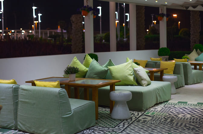
The best way to incorporate it is to place potted plants at the restaurant’s entrance or on the tables as centerpieces. A vertical garden wall of succulents or herbs will serve as an awesome accent wall. Create garden walls on the back of the tables to add liveliness and tranquility.
3. Purple
Considered as a regal color, it induces elegance and exclusivity in any restaurant décor. That’s why this shade is perfect for an upscaled-themed diner. When used thoughtfully, it can invoke a sense of luxury, sophistication, and intrigue in the ambience. This will automatically make your guests feel drawn to your restaurant.

Combine purple and pink shades to create a feminine-themed restaurant. Add purple-shaded upholstered furniture with wooden tables for a posh and luxurious setup. You can also use accent lights with purple hues to create an enigmatic and engaging ambience.
Neutral Colors: Versatile and Sophisticated
1. White, Beige, and Gray
When it comes to neutral shades, these are the best colors for restaurants. However, you need to be very strategic in placing them so as to create a well-balanced look. They convey modernity, simplicity, and cleanliness, which is why your indoor décor will appear appealing to most guests. Each shade has a specific role to play.

White symbolizes purity and peace. Beige, on the other hand, offers warmth and comfort to the guests. Gray can be used to make the place look more elegant, balanced, and sophisticated.
Choosing The Right Colors For Your Restaurant Concept
A. Aligning Color Selection With Brand Identity
Having countless options can leave you overwhelmed. It will make choosing the best colors for restaurants extremely challenging, especially if it’s your first time. Even seasoned players also struggle with deciding which shades to use for decorating their diners.
That’s why begin with the very basics- your brand’s identity and the target audience. Whatever color you choose should align with these two factors completely. Take millennials as an example! They will most prefer balance, cleanliness, and peacefulness over everything else. So, go with cool tones with black or white as complementary shades.
Similarly, if we talk about a burger or hotdog joint, warmer shades will form the perfect restaurant color palette idea. These will instantly increase the hunger level by several notches, keeping your guests rooted to their place, waiting for the delicious food to be served.
B. Consider the Cuisine Type
The restaurant color scheme ideas you shortlist should define your cuisine amicably, leaving no gaps or discrepancies. Here’s a brief guide for you!
1. Fast food
These restaurants thrive on quick turnovers. So, you need to keep the energy of your customers at the topmost level possible. Play with warm colors, like red, yellow, and orange to increase their hunger and excitement, all the same time.
2. Fine dining
Such a restaurant theme demands an interior that feels cozy and soothing for longer stays. You cannot go wrong with the color palette, especially as the décor has to be upscale. So, opt for different variants from the blue or deep red spectrum. Balance the darker shades with gold, white, or beige for a more sophisticated and minimalist look.
3. Bakeries and cafes
As providing comfort is the ultimate goal, look for a color palette rich in earth or soft pastel tones. Take a bakery as an example. Here, you can create an inviting look with a combination of pastel pink and mint green shades. Similarly, combine lavender with baby blue hue to make the café look more elegant, calming, and upscale.
Also Read: Bistro vs Café : What’s the difference?
4. Health-focused
For such a cuisine, you will need the best colors for restaurants promoting freshness, wellness, and sustainability. Greens, especially olive, sage, and mint, symbolize vitality and nature. White will put more emphasis on purity and cleanliness. Earth tones, like terracotta or beige, focus on authenticity and warmth.
C. Factor in Restaurant Size and Lighting
While looking for an ideal color palette, consider the space and the illumination levels. Smaller places, like a café or a bakery, look airy and open when highlighted with soft pastels and neutral shades. On the other hand, larger restaurants, like a fine dining setup, can easily carry and demonstrate the beauty of darker and bolder colors.
In addition to this, also consider the ambient lighting. Bright colors, like red, golden, and white will add more grace to a restaurant indoor having dim or artificial lighting. Neutral and earthy hues pair well with spaces receiving more natural light.
Practical Tips For Applying Color in Your Restaurant
Add Accent Walls
Most often, using a single shade for the entire restaurant layout can become overwhelming and won’t be acceptable. So, instead, begin with an accent wall. Whether you want to incorporate bright red or dark purple as the main color, this will act as the main focal point. To top it off, the wall will add more depth and dimension, especially to smaller areas.
Leverage Décor, Artwork, And Furniture
These are the perfect ways to incorporate multiple colors simultaneously in a subtle manner. Purple or blue colored upholstered sofas, orange-colored metal chairs, and golden tableware will add a cohesive look to your restaurant indoor.
Coordinate Colors With Logo And Menu Design
One of the best ways to incorporate a statement color palette is to align the brand’s logo and the menu design with the same. Take a health-centric or farm-to-table themed diner as an example. Creating a menu with green colors or a branding logo with earthy hues will portray your commitment towards sustainability and eco-friendliness.
Choose Refreshing Colors For the Exterior
It’s not about the interiors only! Rather, you need to focus on the exterior design equally, if not more. Look for restaurant color schemes that will create an enticing and appealing visual for your customers standing outside.
Don’t Overlook Restroom and Bar Areas
A well-colored restroom or an accent backsplash in the bar area will elevate the perceptions of your restaurant easily. Choose the colors strategically so that you can align the palette with the rest of your indoor décor and setup.
Get Most Out Of Your Restaurant Colors
Choosing the best colors for a restaurant can be tedious work if you are not aware of their significance. Whether it’s the bright red shade or a muted pastel hue, every color you select will have a huge influence on your guests. so, be very strategic and ensure you do not go overboard by combining too many statement shades from different categories. Otherwise, it will overwhelm your guests and won’t help you enhance their dining experience.
FAQs
The best wall colors depend on the restaurant’s vibe and target audience. Warm tones like red and orange boost appetite and energy, making them good for casual eateries. Cooler shades like blue and green evoke calmness, ideal for fine dining. Neutral colors offer flexibility and a clean backdrop.
Warm colors like red and yellow are generally the most appetizing. These shades stimulate the senses and grab attention, making the food appear more appealing. They often evoke feelings of warmth and comfort, encouraging people to eat more. It’s no surprise you’ll find them frequently in food advertising.
The palette will depend on your restaurant’s theme, target customers, and the indoor layout. Go with the shades that will help you engage your guests for long hours without overwhelming their senses too much.
If you want to increase the hunger levels and boost your guests to place quick but big orders, go with warmer tones like red, orange, and yellow.
Blue is ideally not chosen to decorate a restaurant’s indoor as it can suppress one’s hunger. However, you can pair it with other colors evoking opposite emotions, like white for peacefulness, green for nature, and so on.
If your restaurant has a smaller space, use bright shades like yellow, orange, green, and red to create an illumination of a bigger indoor.
Decide whether you want to impart warmth and coziness or play on tranquility and refreshing vibes. Based on that, you have to decide a color scheme that can be aligned with your cuisine and the restaurant’s theme.
Warm metallic with moody blue, lush green with earthy neutrals, sunset tones, and minimalist monochromes are the trendiest color palettes for restaurants in 2025.
Yes, lighting will indeed influence how the paint is perceived in your restaurant.